Context
Three people were working on the same forecasting model. Every handoff introduced delay, error, and lost context.
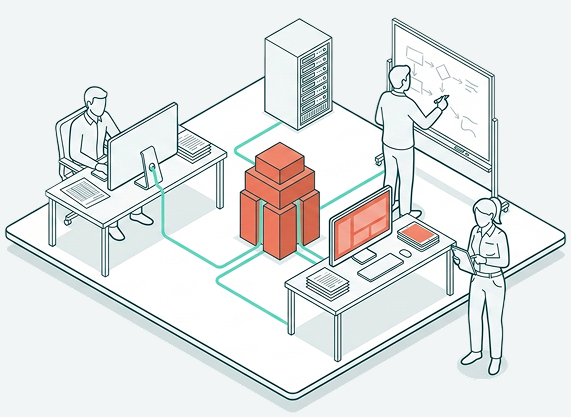
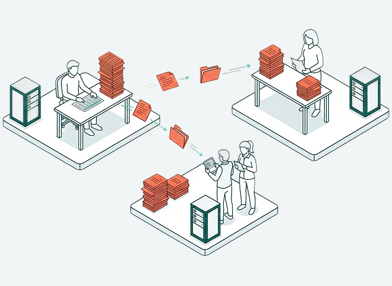
The retailer's labor forecasting ran on active but fragmented coordination: a DC Flow Analyst built a volume forecast in Excel, handed it to a Finance Manager who manually translated it into a labor plan, and Industrial Engineers ran efficiency scenarios against the same underlying data — exchanging updates with both teams, but via file handoffs, not a shared system. Each persona maintained their own copy of the data, uploading whatever the others sent them to stay current. When something changed — a store opening, a volume shift — the correction traveled through all three people again. The design goal: replace that chain of handoffs with a unified platform that serves three distinct user types, accommodates lengthy model runs, and feeds outputs directly into financial planning systems and operational scorecards.
System Failure
The problem wasn't that the process was slow. It was that there was no shared system.
Volume forecasts lived in files. Finance plans lived in separate files. Industrial Engineers ran simulations against the same underlying data and shared updates with both teams, but every exchange was a file handoff. Each persona uploaded whatever the others sent them and worked from their own local copy. Every week, someone reformatted something another person had built. When a forecast changed between Week 1 and Week 4, there was no way to explain why — the model ran in a black box and results were passed person to person without a shared space to interrogate them.
The Reframe
Product asked for a forecasting tool with simulation. Discovery revealed a second, structurally different problem that would have broken the first.
During a workshop to map the forecasting process, something that both product and UX understood in pieces became clear as a design implication: the forecast isn't a snapshot. It's a moving window. A forecast for Week 13 calculated in Week 1 and a forecast for Week 13 calculated in Week 4 are built from different data, produce different outputs, and answer a different question. Users needed to understand not just what the forecast said, but how it had changed as new actuals came in.
Product was already thinking about simulation comparison — running two scenarios and picking the better one. That's a real need. But it's a different need. Temporal comparison (how has this forecast drifted over time?) and scenario comparison (how does this projection beat that one?) look similar on the surface. They require completely different information architectures underneath.
Collapsing them into a single "compare" view would have broken both. The workshop structured the conversation that turned shared domain knowledge into a named, solvable design problem. Naming the distinction before design began is what made both trackable without either becoming a detour.
Process & Key Decisions
The project started in FigJam, not Figma. The first artifacts were analytical — and they shaped everything downstream.
Problem Definition — Before wireframes, I built a Problem Definition canvas: problem statement, target users, outcomes, scope, measurement targets, and key challenges. Three personas is a challenge that surfaces immediately in any conversation about what "done" looks like. Making it explicit before design began created a shared definition before anyone could disagree about it later.
Service Blueprint — Three persona lanes, model run dependencies, decision points, and backend system layers. Two things became visible that weren't visible before: a linear dependency (Finance can't submit until Volume does) and an async problem (52-week model runs exceed one hour — users submit, leave, and come back).
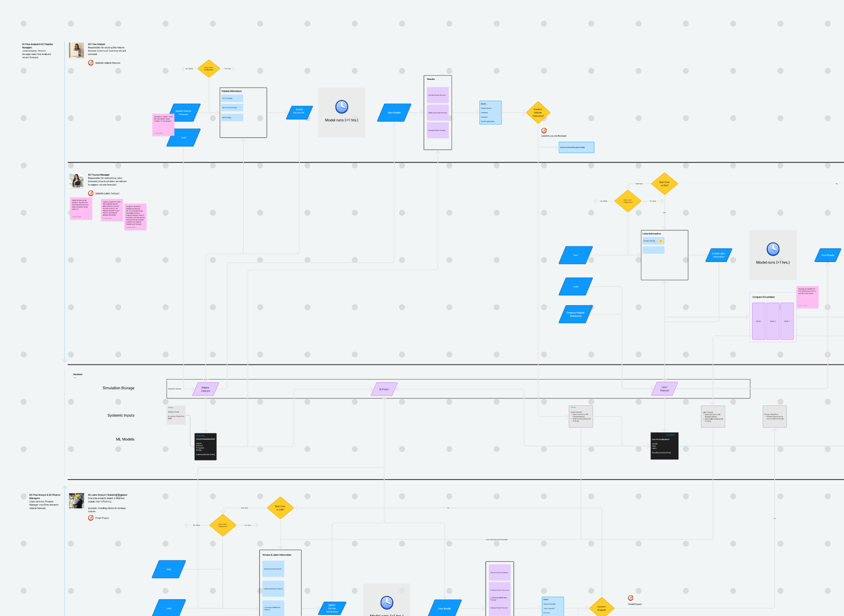
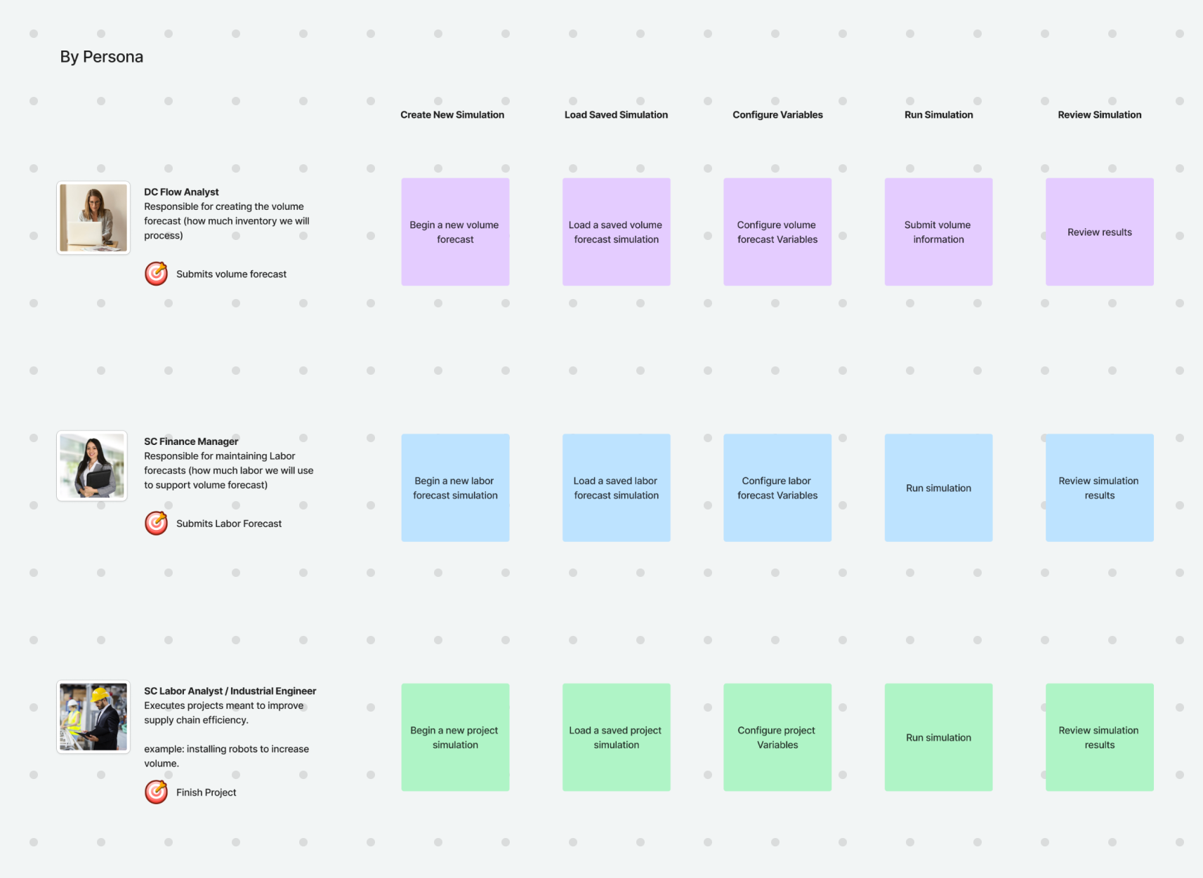
User Tasking — A task matrix across all three personas and eight task categories (create, load, configure, run, review, save, compare, submit) grounded every design decision in what users actually needed to do.
Information Architecture — Five screen categories: Home, Configuration, Read Only, Review & Submit, and Compare & Submit. The key structural decision: comparison mode as a parallel track, not a detour. A user comparing forecasts doesn't lose their place in the primary review flow — they enter a mirrored version of it.
Async UX — For model runs exceeding an hour, the solution was intentionally simple: a status flag on the project card plus email notification when results were ready. Users don't need a progress bar for a process they're not watching. They need a trust signal that the system hasn't lost their submission.
Outcomes & Impact
Engineering is still in progress. What shipped first was organizational clarity.
The design produced a service blueprint, user tasking model, complete IA, and low-fidelity wireframes used directly in stakeholder presentations. They became the shared language for how product and engineering approached the build. The artifacts shaped how the organization thought about the problem before a line of code was written.
The tool is designed for 200 users. Target outcomes are: 5% reduction in temp labor, 12% reduction in overtime, 3% reduction in key job function hours.
Reflection
The service blueprint was the most valuable artifact. The wireframes came later. The clarity came first.
The blueprint is where the structural problem became legible — where the linear persona dependency, the async model timing, and the locked/configurable permission logic all became visible at once. Everything downstream was easier because of it.
If I revisited anything: I'd define what "model explainability" means as a measurable outcome before design began. We named it as a user need. We didn't define what success looked like. What does a user need to be able to say after reviewing a changed forecast? That question, answered early, would have sharpened several design decisions.