
Context
Retail schedulers were making high-stakes staffing decisions inside a tool that couldn't show them the information they needed to make those decisions.
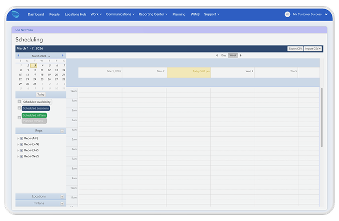
The scheduling tool required schedulers to click into each event individually — no drag-and-drop, no team visibility, no way to see coverage and availability at the same time. The calendar showed the company's overall schedule, not the scheduler's team. Information didn't adapt to workflow state: during the assignment decision, schedulers had too little to work with. Everywhere else, too much.
System Failure
The legacy tool showed the same information regardless of what the user was trying to do. That's not a UI problem — it's a structural one.
Static information in a dynamic decision-making context. Schedulers move between two fundamentally different modes: deciding who to assign (high-context, comparative) and confirming what's been scheduled (low-context, confirmatory). The legacy system made no distinction. Every view looked the same regardless of what the user needed to do next. Drag-and-drop on top of that structure would have been faster and still wrong.
The Reframe
The brief asked for drag-and-drop. Discovery revealed the system needed to respond to user intent — not just become easier to click.
Progressive disclosure wasn't a UI pattern applied after the fact. It was the structural premise the entire design was built on: information should adapt to state. Rich context during the decision. Collapsed simplicity once the decision is made.
That reframe changed the architecture. Instead of improving how schedulers interacted with bad structure, we designed structure that matched how they actually think.
Process & Key Decisions
Stakeholder interviews revealed competing needs. Design workshops resolved them.
Ran interviews and competitive analysis across scheduler, retailer, and employee user types. Facilitated cross-functional design workshops that surfaced what was actually in conflict and drove alignment before wireframes began. The PM later identified the workshops as the moment that drove the client's needs to the surface and led the team to the right solution.
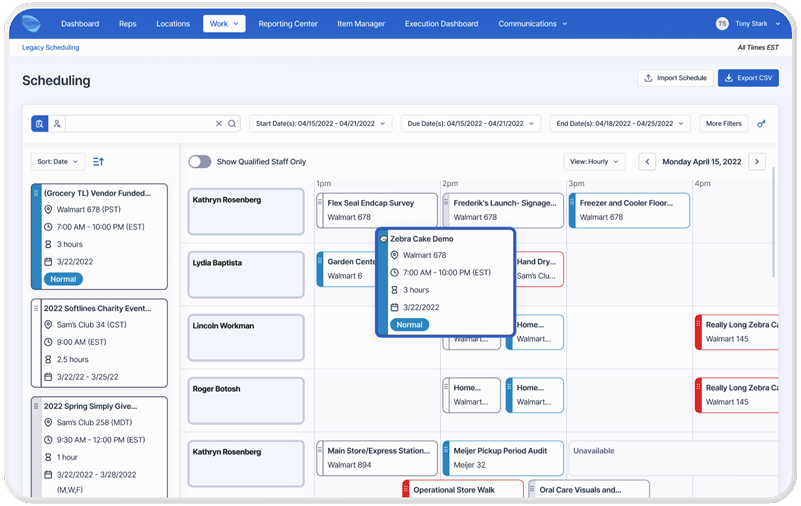
Information Architecture — The split-panel layout was a structural argument: left panel as decision space (unscheduled events, rich metadata, availability), right panel as confirmation space (team calendar, named employee rows, coverage at a glance). The calendar redesign — from company-wide to team-centric with individual named rows — was the single change that made birds-eye coverage visibility possible.
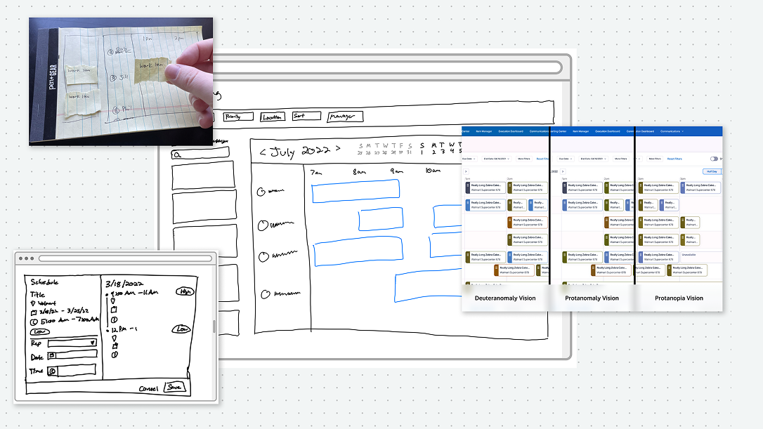
Card States — Expanded card carries full metadata needed during assignment. Collapsed card becomes a clean label on the calendar once the decision is made. Four layout explorations before landing on the final direction.
Accessibility — Keyboard navigation and WCAG-compliant interaction patterns built into the scheduling interface. Color style updates for accessibility compliance extended system-wide: every component in the product inherited the improvement.
Outcomes & Impact
~40% faster scheduling. Eliminated errors. Components shipped to the design system.
~40% reduction in scheduling time per scheduler, measured via timed comparative testing with the Figma prototype against the legacy experience. Tested with internal employees and client stakeholders.
Eliminated scheduling errors through availability-aware assignment and intuitive drag-and-drop. Positive adoption signals in early testing. Scheduling card components incorporated into the design system. WCAG color updates applied product-wide — every component, not just this feature.
~40% scheduling time reduction (prototype-validated). Eliminated scheduling errors. Card components incorporated into the Movista design system. WCAG color updates applied across every product component.
Reflection
The reframe was the work. Everything else followed from it.
Drag-and-drop on a broken information architecture would have been faster and still wrong. Discovery revealed that schedulers didn't need a better way to interact with bad structure — they needed structure that matched how they actually think.
If I revisited anything: I'd instrument error rate from day one. Scheduling errors carry real downstream cost for retailers, employees, and the business. Time reduction is easy to measure. Trust recovery and error elimination are harder. Both matter more.